Wednesday, April 30, 2008

Il Finale


Final few things......

So it has been a CRAZY couple of weeks. I sliced my finger last night to the point where there is a bubble in it. It's bad but it could have been worse and I am so thankful that it wasn't!!!! But anyways we're all still here and its almost over.  We can sit back relax and wait on the results. I personally am going to celebrate my 21st birthday like its supposed to be celebrated, since I didnt get much of a chance to celebrate last Saturday!!!

Special shout out to Jason Dooley for introducing the "t-shirt trick"! lol! I had to use that a few times, and it took a bit of elbow grease but it worked successfully!

Well anyways Good luck to everyone!!

Here are a few updated layouts and projects that I haven't posted yet.


I added a little color to these....I say they look better. u?


Thursday, April 17, 2008

Revised Ads

I revised my original ads with some of the suggestions I received in class. Any comments??
I know they are not complete and final but any suggestions to help me reach the end!?


More fine touches! Color choices.

Which color??
I personally like the darker one, but I've received comments about the darker color distracting from my logo and it makes it a little too busy.  I'm all for comments and constructive criticism. So give em to me people! Por favor.


making some fine touches

I revised the layout for my stationary...good, bad?

Tuesday, April 8, 2008

Taking Suggestions por favor!


Suggestions are definitely welcome


GRD 3000 stuff.

Need to Revise


not so final.....ATTENTION EVERYONE feel free to post comments on my blog. I remember some of the suggestions made but refresh my memory if you don't mind. I would greatly appreciate.


Tuesday, April 1, 2008

Friday, March 28, 2008

ADS......FINALLY!


I finally have a concrete idea that I like I am just working on executing it into the final stages.
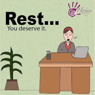
the 8.5 x 11 is not complete because the type solution is just a fill in for right now and the you deserve it on both layouts is going to be a different font. I feel like the 8.5 x 11 is somewhat empty so  if  there are any suggestions on that then let me have them! But maybe if the type is right there it won't look so empty.
        

Friday, March 21, 2008

Any suggestions??


I know the baby's face is a little freaky, but it's still in progress.  I'm trying to go for like the typical busy woman dealing with everyday life.  This is only my first idea. I plan on working with some other ones, but this is the one I'm having trouble with.  I like the idea behind it so I'm looking for ways to make it successful.


Any preferences on type?? The very top and the very bottom are handwritten using the pencil and brush tool in illustrator.  The others are a variation of types I found that look like handwritten type. 

Necesito Ayuda........HEEELLPP!!

Okay so Ads....umm. I need suggestions. I have some ideas on what I want to do, but I'm having a problem translating them to the computer I feel like everything that I've done looks really.....I hate to say amateur, but that's the only word I can think of.  I am not sure whether to illustrate them which is what I'm interested in, but the way I've illustrated them up to this point is to draw them straight into illustrator using the pencil and pen tool. Does anyone have a better idea or way for me to try? Also my first thought was to use photography, but I am not sure if I'll be able to take pictures of what I want to communicate with my ads. I'll post what I have so far and I'm taking any opinions and suggestions!

Thursday, March 20, 2008

Animation Experimentation

I saw other people doing animations so I thought I would take advantage of what I've been learning about flash to try one of my own.  It's really simple and quick, but I am learning as  I go.


Tuesday, March 18, 2008

Funny Ads


Would you really want to buy this toothpaste seeing that guy there?! lol

Tuesday, March 11, 2008

A race to the finish

Working on fine tuning the last few things on my stationary. Still so many designs, but I think I know which direction I want to head in.


Monday, March 10, 2008

Animation for Drawing and Comp.

This is an animation I did for drawing and composition. We are working on this for at the same time, and I was thinking maybe this can help me develop further ideas when dealing with my client. This definitely has a more illustrative quality to it, and I'm not sure that it lends itself to the type of client that I'm dealing with, but even so it can help my creative juices continue to flow!!

I'm not sure why its going so slow, but you get the drift!


Thursday, February 28, 2008

Other Stationary Variations


I updated this stationary again based on suggetions I received in class on what could make it better.  I removed the bar and  I made the type slightly smaller and I also changed the color of the type at the bottom.

Wednesday, February 27, 2008

Updated Work and Business Card Beginnings


I wanted the card to be very simple and nothing too overdone.....I'm thinking the type is too big.
I'm having trouble with business cards though!


Changed the transparency on certain objects to see if that helped the clarity of the letter.
Trying to work on not DECORATING....i'm not sure if its working yet!

Tuesday, February 26, 2008

Updated Hand Logo

Worked with silhouette of the scan of my own hand and made the hand smoother.


Experimenting with Hand

Experimenting with using scans of hand as logo....or at least using the scans to form my logo.


Thursday, February 21, 2008

Stationary Stuff

LOOKY LOOKY...............


(front) (back)


I am pretty happy with what i have so far, but i'm still working on not having the stationary so busy and making it easier to read.